Hacking The Humanities Midterm
Margo Lewis
Margo Lewis
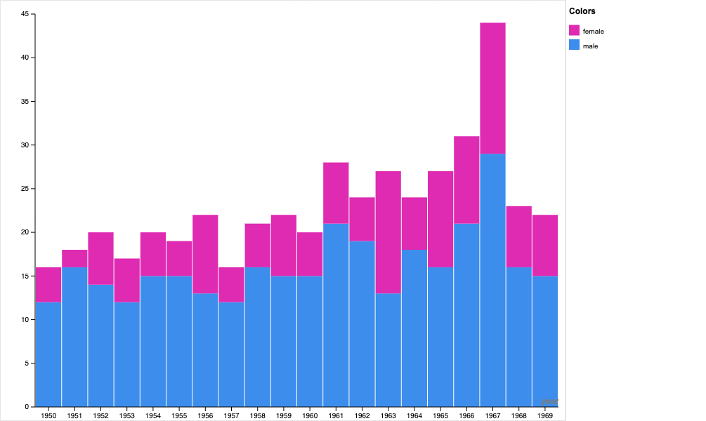
Number of artists per birth year by gender at the Tate Gallery.
For my project, I wanted to explore the proportion of male and female artists over time at the Tate Gallery. The Tate Gallery is a museum in London that houses a large collection of contemporary and modern art. Historically, art has been dominated by male artists. I was interested in seeing if male artists dominated the collection at the Tate Gallery, and if the gender breakdown of artists was related to their year of birth.
I used the dataset containing information about artists in the Tate Gallery with birth years from 1950-1959. The variables included artist name, gender, year of birth, and place of birth. The dataset includes information about 472 artists.
In order to clean the data, I used R. I started by removing all the variables I wasn’t interested in, and was left with just year of birth and gender. Once I had that, I removed all the data points that didn’t have information for either year of birth or gender. I was left with 461 data points. I wanted to use rawgraphs.io for my visualization, so I needed to slightly reformat the data. I made a column for each birth year, and then a column for the total number of female artists born in that year and a column for the total number of male artists born in that year. Once I had that, I was able to import the dataset into rawgraphs.io and create a stacked bar chart. I used the year of birth as the x-axis and the size was the total number of male artists and the total number female artists.
To create my website, I made a new subdomain for the midterm. I then used installatron to create a new wordpress website. I wanted to keep the design of the website simple, so you could easily real and understand the information. I led with the data visualization as a way to draw in the readers attention, which would hopefully make them curious about the components of the project.
By creating a bar graph using rawgraphs.io, viewers can better understand the data. The graph allows you to visually see the difference in the number of male and female artists clearly. It also shows how generally the number of artists in the gallery is greater for later years of birth. It is interesting to see that the proportion of male artists is much higher than the proportion of female artists, even in later years. This project relates to digital arts and humanities because we are using data science tools to understand topics in the humanities. Instead of just using technology for pure data analysis, we can use tools like rawgraphs.io to creatively express trends in various topics relating to humanities.